When it comes to instantly recognizable brands worldwide, few logos carry the universal recognition and emotional resonance of the Lay’s logo.
The bright golden circle, the flowing red ribbon, and the cheerful, inviting lettering are more than just a decorative label on a bag of potato chips.
They are symbols of a nearly century-long journey in snack food history, capturing the brand’s heritage, values, and creative evolution. At first glance, the logo seems simple and approachable, but a deeper examination reveals the thoughtful design and strategic branding that have helped Lay’s become one of the most beloved snack brands globally.
The Lay’s logo is more than just a visual mark—it is a story condensed into shapes, colors, and typography. Every element communicates something intentional: warmth, energy, joy, and reliability.
It is a testament to the power of branding and design, showing how even the smallest details can have a lasting impact on consumer perception.
A Brief History of Lay’s
The story of Lay’s begins in 1932, when Herman Lay, a young entrepreneur from Tennessee, established a small regional snack business.
With a vision for quality and a keen understanding of consumer appeal, Lay set out to create potato chips that would capture the hearts and taste buds of Americans.
Initially, the business focused on local distribution, selling chips from the trunks of cars and small storefronts. Herman Lay’s dedication to both product excellence and customer experience laid the foundation for what would eventually become a global brand.
Over the decades, Lay’s expanded rapidly. Herman Lay was not merely a businessman; he was a pioneer in marketing and branding long before these concepts were widely understood.
He recognized that building a strong brand identity could create loyalty, and this philosophy guided many of his early decisions.
The company’s major turning point came in 1961 when Lay’s merged with the Frito Company to form Frito-Lay, creating a snack food powerhouse that dominated the American market. Later, Frito-Lay became a division of PepsiCo, further solidifying its position as a leading brand not only in the United States but globally.
This merger was significant, as it combined two innovative snack companies with complementary strengths, allowing for broader distribution, diversified product lines, and enhanced marketing capabilities.
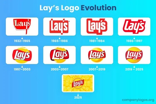
The Evolution of the Lay’s Logo
The Lay’s logo has evolved significantly over time, reflecting the brand’s growth, corporate relationships, and consumer trends. Early versions of the logo were straightforward, often focusing solely on the brand name in bold lettering.
However, as Lay’s grew and merged with Frito-Lay, designers began to incorporate elements that subtly linked the brand to its parent company while retaining Lay’s unique identity.
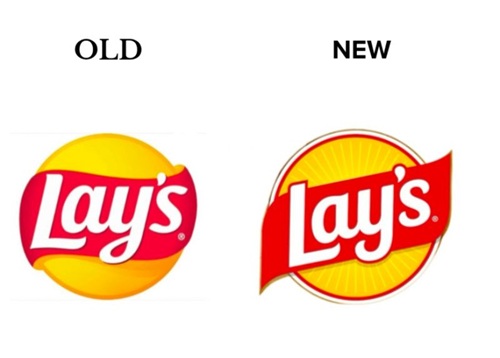
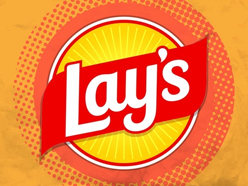
One of the most enduring features of the logo is the yellow circle, which forms the backdrop for the brand name. This golden circle is far from arbitrary.
Inspired by the sun-like emblem in the Frito-Lay logo, the circle conveys warmth, vitality, and optimism. Yellow, in color psychology, evokes feelings of happiness, energy, and friendliness, making it an ideal choice for a snack food brand. It signals positivity to consumers and fosters an emotional connection even before a single chip is tasted.
Adding to this foundation is the red swoosh, a ribbon-like shape that flows dynamically across the logo. The red element injects excitement and movement, visually suggesting energy, passion, and appetite stimulation.
Color psychologists often note that red can increase appetite and grab attention, making it an ideal complement to the bright yellow.
The combination of yellow and red is both striking and effective, explaining why it has become a classic palette in the food and beverage industry worldwide.
Typography and Design Details
Beyond color, the typography of the Lay’s logo is a crucial element in its overall effectiveness. The rounded, playful font conveys approachability and friendliness.
Its gentle curves make the logo feel inviting and inclusive, appealing to a broad demographic that spans children, adults, and international audiences.
The font harmonizes with the red swoosh, creating a sense of movement and balance that is both visually appealing and memorable.
Each design choice, from the spacing of the letters to the flow of the text across the circular backdrop, is intentional. These elements collectively reinforce the brand’s core identity: joyful, dependable, and universally recognized.
The logo is designed to evoke positive emotions, building familiarity and loyalty in a way that few simple visual marks can achieve.
Symbolism and Emotional Connection
The Lay’s logo does more than identify a product—it tells a story. It captures the history of a small business founded in Tennessee, the strategic expansion through mergers, and the enduring commitment to quality and customer experience.
The golden circle and red ribbon together communicate a sense of energy and warmth, aligning with the joyful experience of opening a bag of chips and sharing it with friends or family.
Moreover, the logo subtly reinforces the connection to Frito-Lay. While Lay’s maintains its individual identity, the design acknowledges the parent company’s influence and reputation, which is known for quality, consistency, and broad product reach.
This dual identity strengthens consumer confidence, signaling both heritage and reliability.
Branding Strategy and Corporate Significance
The evolution of the Lay’s logo demonstrates an important principle in branding: the need to balance tradition with modernization.
As consumer preferences evolve, logos must adapt without losing the essence that makes a brand recognizable. Lay’s has accomplished this through incremental updates that refine the color palette, typography, and design elements while maintaining the recognizable yellow-and-red scheme.
This careful branding strategy allows Lay’s to benefit from the reputation of PepsiCo and Frito-Lay without diluting its unique identity.
Consumers see the logo and immediately associate it with a trusted, enjoyable product, while also understanding that it is part of a larger network of high-quality snack foods.
The logo also reinforces marketing campaigns and product packaging strategies. Its bright, cheerful appearance attracts attention on crowded store shelves, communicates the brand’s identity instantly, and enhances the perceived value of the product.
Cultural Impact and Recognition
Over nearly a century, the Lay’s logo has transcended its functional role as a product identifier to become a cultural icon. People recognize the logo globally, associating it with moments of leisure, celebration, and enjoyment.
Whether it’s a casual snack at home, a picnic in the park, or a party with friends, Lay’s has positioned itself as a go-to choice, and the logo plays a central role in that recognition.
Its universal appeal also allows Lay’s to introduce new flavors, limited-edition products, and region-specific varieties without straying from its core visual identity.
Consumers can experiment with flavors while still feeling the emotional consistency that comes from the familiar logo.
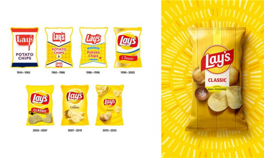
Design Evolution Over the Years
Over the decades, the Lay’s logo has undergone subtle transformations. Early versions were less dynamic, often focusing on bold text with minimal additional elements.
As the brand matured, designers incorporated the circular emblem, the red swoosh, and more playful typography. These changes reflect broader trends in marketing and visual communication, where brands aim for instant recognition and emotional resonance.
Digital media, international markets, and packaging innovations also influenced logo updates. Designers had to ensure that the logo remained clear and impactful not only on physical bags but also in online advertising,
social media campaigns, and global marketing efforts. This adaptability has contributed to the logo’s longevity and relevance.
Psychology of Colors in the Lay’s Logo
Color psychology plays a pivotal role in the logo’s success. The yellow background conveys joy, friendliness, and warmth, making the brand instantly approachable. Yellow is also attention-grabbing, ensuring that the product stands out on store shelves.
The red swoosh adds excitement, energy, and a sense of movement, stimulating appetite and creating visual contrast. Together, the colors evoke a combination of happiness and hunger, subtly encouraging consumers to purchase and enjoy the product.
These choices are far from accidental; they reflect careful consideration of human psychology and marketing principles, ensuring that the logo resonates with consumers on both conscious and subconscious levels.
Typography and Playfulness
The rounded, flowing typography of Lay’s is another critical component of its identity. The letters are soft and approachable, avoiding harsh angles that might convey rigidity or formality. This choice aligns with Lay’s brand promise: a fun, enjoyable snack for everyone.
The font’s integration with the red swoosh adds a sense of motion and liveliness. The overall effect is a harmonious, cheerful design that conveys trust, enjoyment, and energy, perfectly matching the experience of opening a bag of crispy potato chips.
A Symbol Beyond Snacks
The Lay’s logo represents more than just chips. It encapsulates decades of innovation, marketing expertise, and emotional connection with consumers. It is a visual shorthand for happiness, social connection, and indulgence in everyday pleasures.
Every bag, every advertisement, and every store display reinforces this connection, making Lay’s a brand that is more than just a snack—it is an experience.
The logo also demonstrates the power of simplicity in design. Despite its minimalistic elements—a circle, a swoosh, and text—it communicates depth, history, and emotion. This balance of simplicity and meaning is a hallmark of effective branding.
Global Recognition and Adaptation
Lay’s is sold in over 100 countries, and the logo’s design has proven adaptable across cultures while retaining its core identity. In international markets, local flavors and packaging variations exist, but the logo provides consistency, ensuring that consumers immediately recognize the brand regardless of geography.
This global recognition speaks to the logo’s effectiveness and universality.
The golden circle and red swoosh remain universally appealing, while the playful typography conveys approachability across languages and cultures. Even when translated or adapted, the logo maintains its joyful and inviting essence, highlighting the strategic foresight of its designers.
Conclusion: More Than Just a Logo
Next time you pick up a bag of Lay’s potato chips, pause to consider the story behind the logo. The golden circle, the vibrant red swoosh, and the flowing letters are not mere decorations—they are symbols of heritage, quality, and joy.
They reflect the vision of Herman Lay, honor the legacy of Frito-Lay, and resonate emotionally with millions of snack lovers worldwide.
From its humble beginnings in Tennessee to its current status as a global snack powerhouse, Lay’s has used its logo to communicate warmth, energy, and trust.
The careful combination of colors, typography, and symbolism ensures that every consumer interaction reinforces the brand’s values. The Lay’s logo is a masterclass in branding, demonstrating how thoughtful design can transform a simple product into a cultural icon.
Every time you open a bag of Lay’s, you’re not just enjoying potato chips—you’re participating in nearly a century of innovation, creativity, and joyful snacking.
The logo, bright and cheerful, serves as a reminder that design is never accidental; it is purposeful, meaningful, and deeply connected to a brand’s history and mission.
Through this iconic emblem, Lay’s has successfully created a lasting bond with consumers, proving that great branding combines heritage, emotion, and creativity in ways that transcend generations.